
Whether you are opening your first bar or giving your café a makeover, the colors you choose directly affect your guest experience. We’ll give you the lowdown on how color impacts restaurant design, how to manage your physical space by using color strategically, and how to effectively communicate brand concepts.
What Does Color Communicate to Your Patrons?
Curating your guest experience begins with managing the expectations of your patrons. What they see is what they should receive. By glancing at its interior design, your guests should be able to determine how they will feel during and after their experience in your restaurant. For example, a quick peek inside your establishment should inform your guests whether your space is:
- Quiet and relaxed or loud and bustling?
- Healthy or indulgent?
- Intimate or family style?
- Affordable or luxurious?
- A light bistro or a mixology hotspot?
- Fast casual or fine dining?
Color informs your guests’ expectations. Before we get into individual colors, however, let’s take a step back and see how light and dark color palettes affect our perception of space.
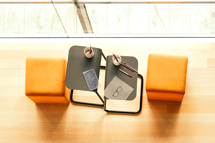
Open Your Space Using Light Colors
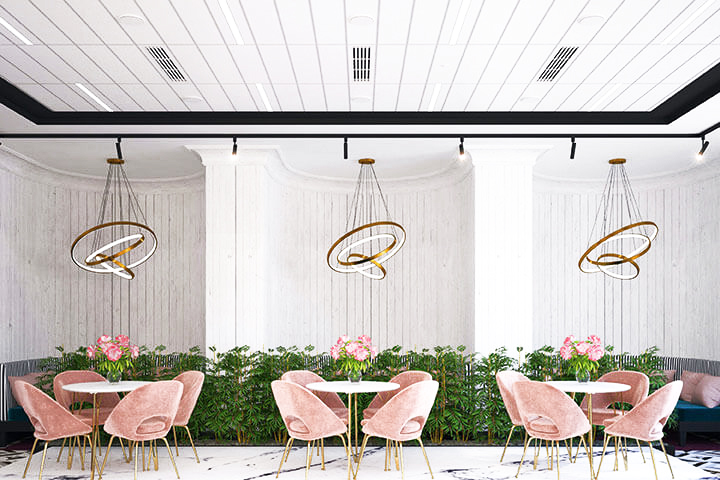
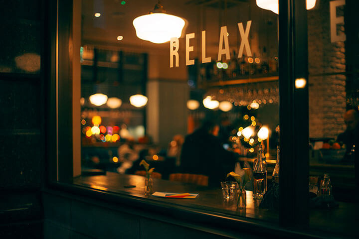
Choosing a light color palette creates a calm yet energetic ambiance. The calm setting encourages customers to relax while remaining awake and alert. People generally make healthier food choices both in ingredients and portion size, when surrounded by soft light tones. Generally, light color schemes work best for breakfast and lunch establishments.
A light color palette can also have a dramatic impact on the perceived size of your space. If your restaurant feels too small, a light color palette will reflect natural light, making the space feel larger. Adding reflective elements is also tremendously helpful to open up a room.
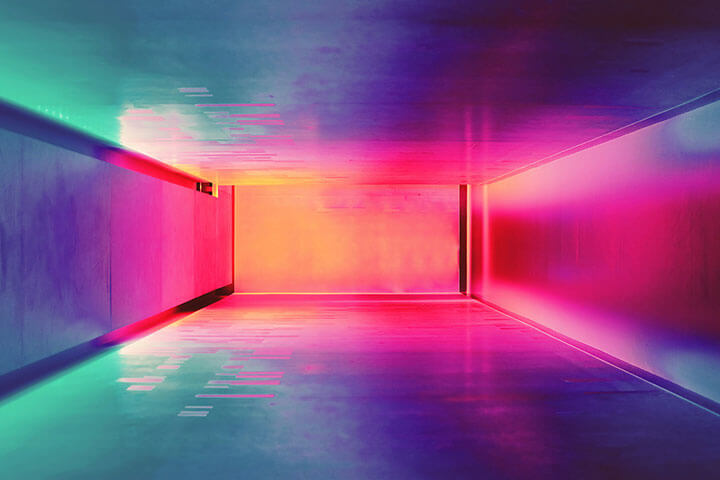
For any section of a room that could benefit from an airier vibe, the same principle applies. For instance, if your ceiling feels too low, paint it the lightest color in the room, to create the perception of a higher ceiling. Or if a space feels too narrow, use light colors on the walls and darker colors for the floor and ceiling to visually widen a room, hallway, or entrance space.
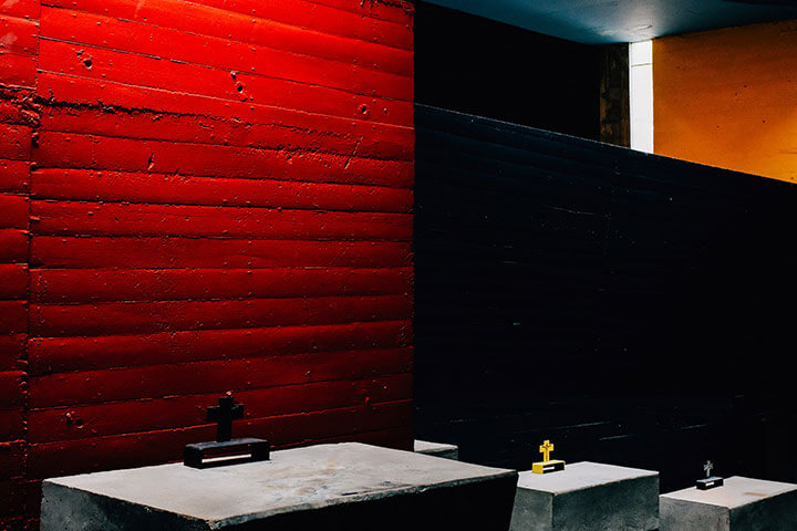
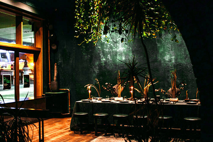
Create an Intimate Ambiance Using Dark Colors
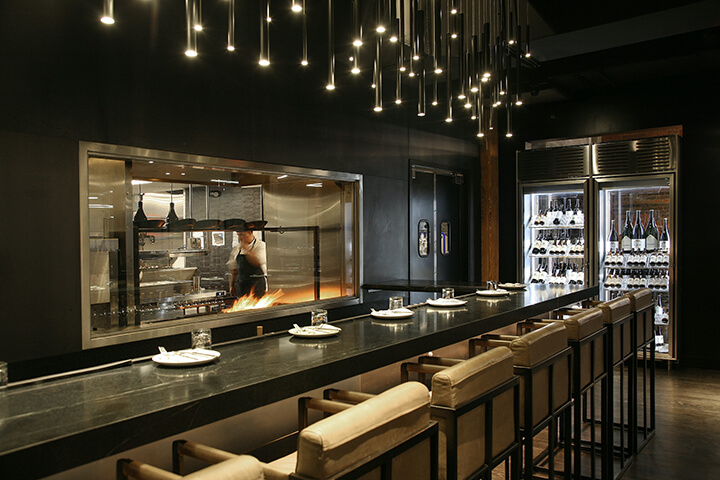
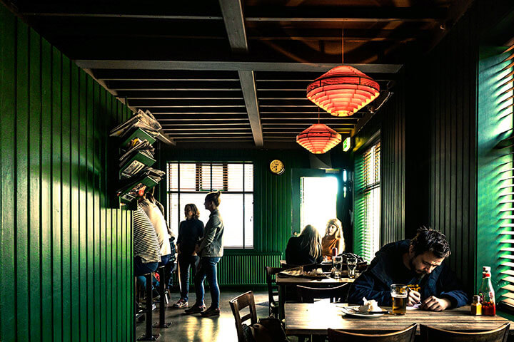
Choosing a dark color palette creates an intimate ambiance. To inspire a cozier, more enclosed feel to your establishment, choosing dark wall colors will do the trick. Not only do dark colors make a room feel smaller, but they also absorb natural light.
Like a protective animal’s den, dark colors also foster feelings of safety, especially if that room has a low to mid-range ceiling. For instance, using the same principals as our light colors, using a dark color will create the illusion of a lower ceiling for a more burrow-like atmosphere. If any part of a room is unbalanced, or you are looking for a dramatic hallway effect, painting the walls a dark color will narrow the perception of space to the naked eye.
The Relationship Between Color Design & Hunger
Colors psychologically provoke or dissuade hunger. Their ability to affect our hunger cues can be broken down into three basic categories: High, medium, and low. To further explore the psychological implications of colors and their effect on restaurant interiors, we will first note at which hunger category your perspective color(s) fall into.
Additionally, we note biological/evolutionary components that may affect our decision making and psychological responses associated with each color. Having a clearer understanding of subconscious expectations is invaluable in curating the ideal experience to attract more of your intended customer demographic.
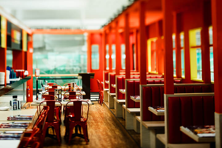
Red: The Hungriest Color
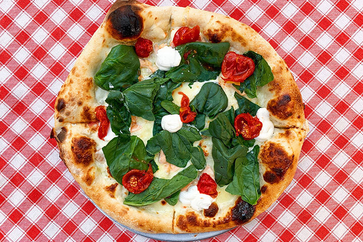
Hunger provocation level: High
A red tablecloth can have a devastating effect on one’s waistline, while having a very positive effect on your restaurant’s average order value.
Red can be aptly described as the hungriest color. Bright red draws our attention and energizes us, stimulating our senses including our appetite. Numerous studies have shown that red subconsciously encourages people to eat more and consume food faster, especially when paired with cheery yellow. For these reasons, it comes as no surprise that red is the most widely used color in the foodservice industry, especially amongst fast-food chains.
Nature dishes out an abundance of red. Bright shades signify healthy, energy-packed fruits and vegetables such as tomatoes, red bell peppers, and cherries. Red can also trigger our evolutionary hunter-gatherer response from a fresh kill.
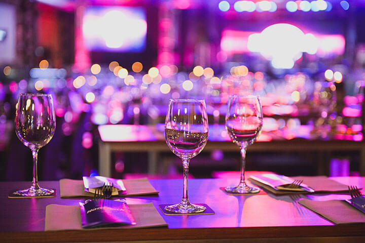
Gazing at bright red has the power to increase our adrenaline, blood pressure, and heart rate. Bright reds especially signify passion and excitement. Dark shades of red can set a sultry scene, perfect for wine bars and other intimate settings.
Orange: Red’s Less Intense, Friendlier Sibling
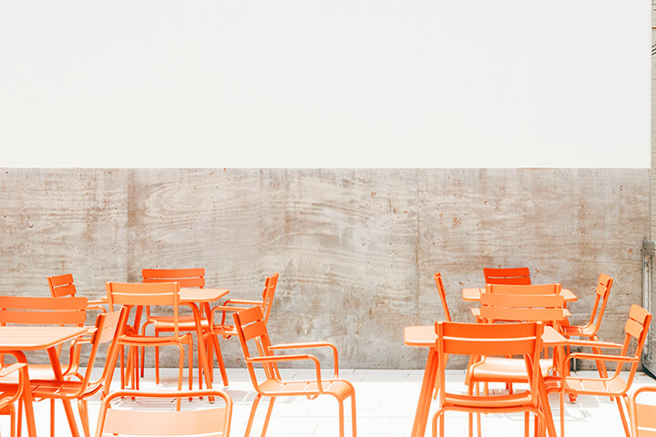
Hunger provocation level: High
Along with red and yellow, orange is one of the most hunger-provoking colors. We have many natural associations with the color orange such as with flowers, sunsets, pumpkins, and their namesake, oranges.
Like red, bright shades of orange stimulate the senses. While able to evoke an energetic emotional response, orange is a comforting, bright, bold, friendlier version of red. Orange is also perceived as a color that signifies good value and persuasive when it comes to impulse buys.
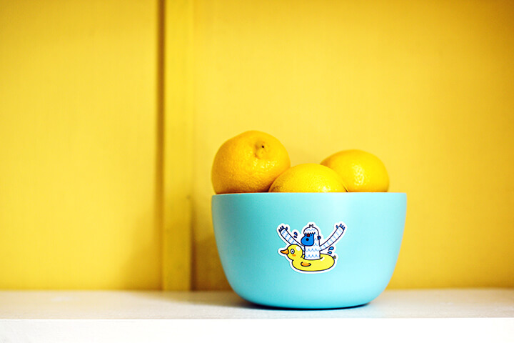
Yellow: Happiness Is a Full Belly
Hunger provocation level: High
Along with red and orange, yellow is one of the most hunger-provoking colors. Not only do people consume more food than normal, but they eat faster when significantly exposed to these three colors.
Yellow is abundant in nature. Starting with the sun, yellow is associated with the energy that fuels life on Earth.
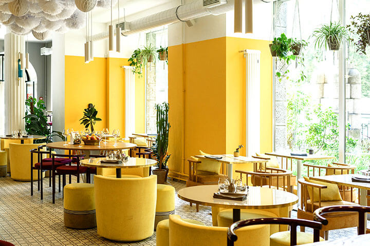
Guests enjoy a serotonin boost in a yellow setting. Both bright and pastel yellows are strongly associated with feelings of happiness, joy, amicability, radiance, creativity, and optimism. Muted yellows have an earthier, calm feel. Likewise, red/orange/yellow color combinations are used rampantly in fast-food establishments because they encourage customers to eat faster, resulting in high turnaround and more sales.
Green: A Health-Conscious Calling Card for All Things Natural
Hunger provocation level: Medium
Considered a mid-range appetite booster, people associate green with organic materials that help to sustain life on earth. At present, our customers regard green as a safe color due to edible plants and vegetation. Evolutionarily, when the choice presents itself, humans migrate towards green, fertile earth. Green food found in nature is very healthy and low in sugar.
Instinctively, people looking for healthier options will always keep an eye out for green. We are doubly rewarded when enveloped in light or vibrant green because it is a calming color that promotes mental wellness and serenity.
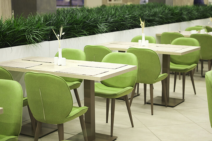
Biophilic design is another popular way to incorporate green into the foodservice arena. Adding plants into a restaurant or café communicates to your guests that your business supports their health and wellbeing. In fact, consumer psychology dictates that adding plants into an indoor space increases the perceived value of your establishment.
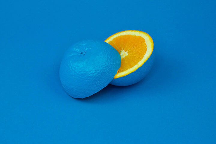
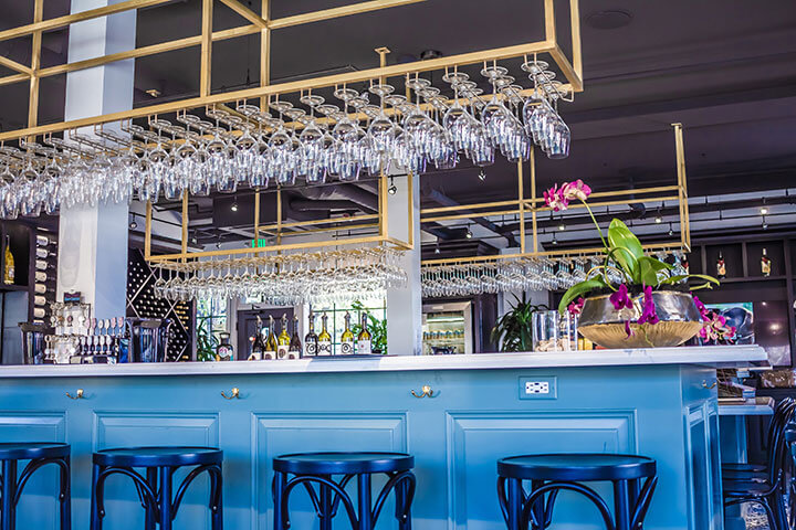
Blue: How About a Refreshing Beverage?
Hunger provocation level: Low
As the opposite of red, blue is an appetite suppressant. However, blue inspires thirst.
When people think of blue, they are reminded of water and sky. With notable exceptions such as berries, blue is largely absent as a natural food source.
Without food on the brain, blue inspires intellectual neural activity. Like gazing at the ocean, blue stimulates mental clarity, encourages reflection, and calms the soul.

Blue is most often used in abundance in seafood restaurants and bars, as it is strongly associated with qualities of water: fresh, soothing, and cool. Using blue on a ceiling creates a celestial feel.
Purple: Complexity Abounds
Hunger provocation level: Low
Like blue, purple is an appetite suppressant. Use purple as an accent color or integrate muted shades. Bright purple lighting, however, is a popular choice for nighttime venues.
Purple is found in many natural food sources such as eggplant, berries, potatoes, wine, and cabbage. We also associate purple with flowers, sunrises, and sunsets.
Being the lovechild of color-wheel opposites — explosive red and stable blue — purple naturally inspires complex emotional responses. Most often seen as a royal color due to purple dye being historically difficult to find or produce, it is associated with nobility and luxury. Purple is also a color that inspires creativity and imagination. Neon purple especially evokes feelings of excitement and whimsy.
Pastel purple reads as fun, soft, and feminine and is most often incorporated into bakeries and candy shops. Similar to deep shades of red that emulates wine, deep shades of purple work beautifully when incorporated into bar settings and other lush palettes.
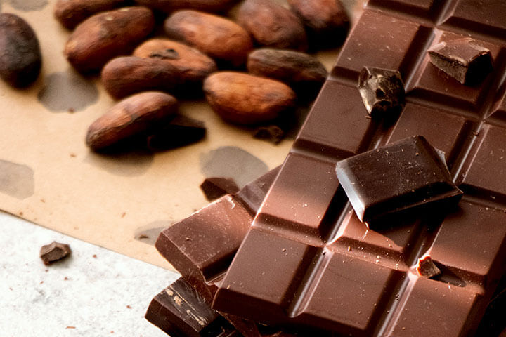
Brown: Cravings May Occur
Hunger provocation level: Wildcard
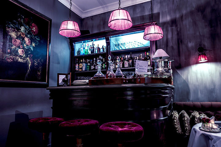
Generally, brown is an appetite suppressant. However, when people associate deep browns with the rich, delicious flavors and bursts of caffeine provided by coffee or chocolate, we may start craving our favorite types. A brown palette is also often seen in whiskey lounges, breweries, and other fine-drinking establishments.
Naturally, shades of brown create an organic feel as people tend to associate it with farming the earth, trees, and soil.
Shades of brown do not provoke intense emotional responses from customers, but instead provide a sense of reliability, earthiness, and wholesomeness. Brown wooden elements successfully incorporate into most every color palette.
Communicating With Color
Colors send strong messages to our customers that affect their emotional state, visual perspective, and appetite. What was your greatest challenge in choosing a color scheme for your restaurant? Let us know in the comment section!

Tips to Turn Your Online Food Business into a Real Location - Growth Strategies 101
Bringing the Casino Home: Recreating the Ultimate Dining Experience - Canadian Menus
We own a sweets and fast food shop
2 walls are covered with wooden furniture and the third wall is transparent.
The last wall isn’t plain hence we are finding it difficult to decide the colour for the same
This information on the color scheme was very informative.
Thank you for your kind comment! We’re very happy you found the information useful.
Color Theory in Interior Design: The Secret Science of Perfect Spaces - Lions Den Capital
Best Cafe Wall Art Ideas To Transform Your Coffee Shop
Best Cafe Wall Art Ideas To Transform Your Coffee Shop - Chitraksh
10 Professional Office Wall Decor Ideas That Inspire
Amazing work