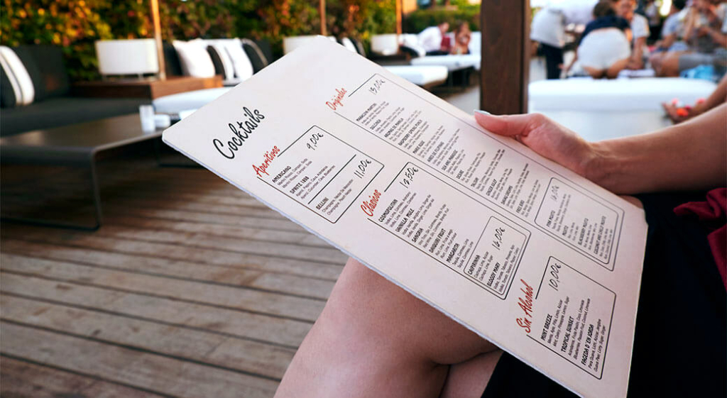
Menu fonts are an important part of restaurant marketing and design because they impact the overall perception of your establishment. Therefore, choosing your fonts is just as important as choosing the right logo or location for your intended culinary demographic. Because fonts are visual elements that psychologically influence your customers, they are very useful tools in further expressing your brand.
We’ll explain how fonts influence your customers’ expectations of your restaurant, café, tavern, or bar. Then, we’ll give you all the information you’ll need to set you on the path of choosing the best menu fonts to communicate your foodservice establishment’s concept.
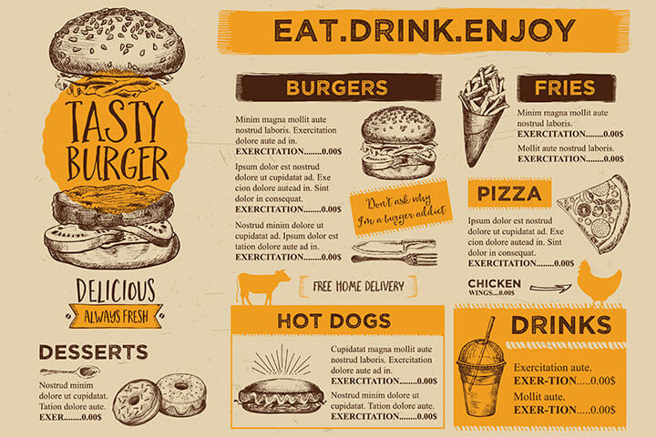
How Menu Fonts Enhance Your Restaurant’s Brand and Customer Experience
Choosing fonts that accurately reflect your establishment’s concept leads to a better customer experience. For instance:
- Fonts express your culinary concept to the viewer.
- Fonts also express the creativity, look, and feel of your establishment. This targets the demographic you seek to serve, drawing in the right clientele for your restaurant.
- The right font accurately communicates the cost and quality of your establishment’s food and beverage with ease.
- Selecting the best fonts for the job also serves to create a strategic menu, guiding the eye naturally through a visual hierarchy.
With thousands of fonts to choose from, selecting the right ones to use as an effective communication and design strategy isn’t easy, but it is entirely within your grasp. Here’s where to start.
Understanding the Differences Between Typeface Families
The first step in choosing the right font to attract and keep customers is to ask yourself what is the message that you want to convey? Ask yourself what mood do you wish to communicate? How do you want people to feel when they read your menu? For instance, are you appealing to their sense of adventure or their preference for the classics? Choose a font style that reflects this message.
Before you can narrow down font choices, however, you’ll first have to decide which typeface family works best for your message. There are generally three typeface families that menu designers choose from: serif, sans serif, and display fonts.
Serif
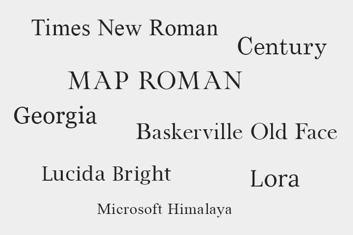
Serifs are the small lines that are attached to the main letterform, making them a serif typeface. They are most often used in books, printed media, and long sections of text. Descriptors people associate with serif fonts include traditional, reliable, respectable, established, and conservative.
Sans Serif
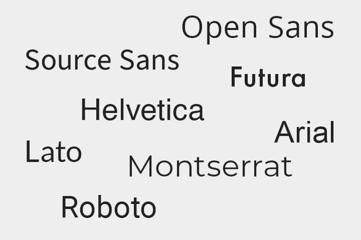
Sans-serif typefaces do not use serifs. It’s a small distinction but one that makes a world of difference in practice. They were originally intended for headlines, but have expanded their influence in our age of modern digital and print design. Descriptors associated with san-serif fonts include clean, modern, efficient, and approachable.
Sans-serif fonts are the easiest to read out of the three. Arial, for instance, is a sans-serif font and one of the most popular choices for menus precisely because it is clean and easy to read.
Display
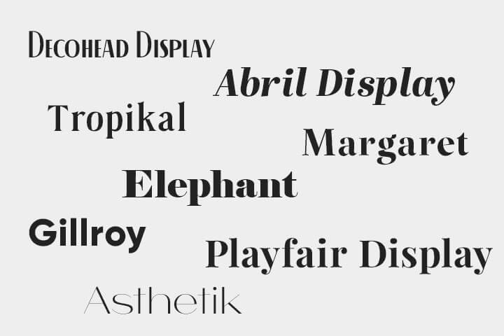
Display fonts are useful for creating a distinctive visual identity, communicating a particular tone or mood, or simply adding some flair to a design. Using a display font in smaller sizes can sometimes lead to legibility issues, so they are best left for elements used to grab your customers’ attention. Descriptors associated with display typefaces include creative, playful, whimsical, and casual.
How Shapes Create Culinary Expectations
The next element of typography you can use to sculpt your message, is how the shape of different fonts subconsciously affect your customers’ expectations.
Round vs. Angular Fonts
Did you know that people unconsciously perceive taste based on shape? Studies have shown that round typefaces indicate sweetness, while angular fonts are more associated with savory, bitter, acidic, and sour food and beverage.
Using two extreme examples, imagine an ice cream shop that chose a very angular font on their menu. This would result in a mixed message to the viewer along the lines of “dangerous ice cream.”
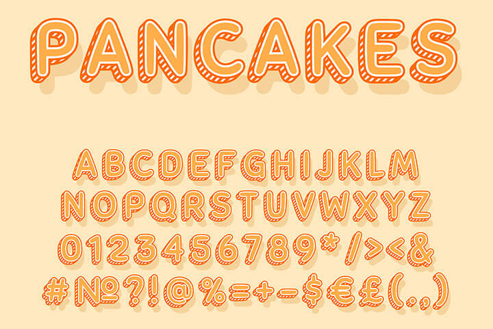
In contrast, using a bubbly font for a high-end American steak house would result in immediate distrust towards the quality and flavor of the meat. By understanding how shape affects flavor perception, menu designers can use this knowledge to craft a more enjoyable and accurate culinary message for their customers.
Special Considerations for Seniors and Children
Certain demographics have specific needs when it comes to menu design. Here are some tips to keep in mind.
Senior Citizens

If the majority of your customers are senior citizens, using a larger typeface will make them more comfortable. Struggling to read a menu because of waning eye sight will most likely result in few repeat customers. Seniors appreciate a larger font setting because it preserves their dignity and independence. Knowing your restaurant will be a stress-free setting for seniors near guarantees repeat customers who bring their friends.
Children
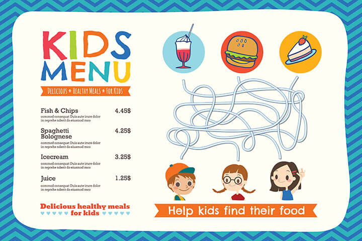
For restaurant menus that cater to children, large font settings in multiple colors aside fun graphics are a must to keep their attention. The more you can entertain kids with a menu, the less likely they are to run wild in your establishment.
Font Pairings
Rather than recommending specific fonts, we’d like to emphasize the importance of font pairings. Combining two types of typeface families on a menu is essential to producing an attractive design that is easy to read. For instance, a good serif and sans serif font pairing provides contrast without conflict when they complement each other.
We also recommend keeping your font selections to a maximum of three and always avoid overused fonts that readers find irritating, such as comic sans or papyrus. Next, we’ll show you three examples of font pairings and briefly explain why they work together.

Baskerville is a classic serif font that is often associated with elegance and sophistication, while Futura is a modern sans-serif font known for its geometric shapes and clean lines.
The contrast between the two fonts can create an interesting visual dynamic, with Baskerville providing a sense of tradition and Futura adding a touch of modernity.

Montserrat and PT Serif Italic are a great font pairing because they have complementary characteristics that make them visually appealing when used together. Montserrat is a geometric sans-serif font with a modern and clean aesthetic, while PT Serif Italic has a classic and elegant feel with its flowing italic script.
The contrast between the two fonts creates a harmonious balance that adds interest and depth to the overall design. Additionally, both fonts are highly legible, making them a practical choice for body text and headlines alike.

Arial Black is a sans-serif font with bold and modern lines, while Times New Roman is a classic serif font with a more traditional and elegant feel. This contrast creates visual interest and helps to distinguish different sections of text. They are both widely available on most computer systems, ensuring consistent formatting across different devices and platforms.
Overall, Arial Black and Times New Roman provide a visually pleasing and readable combination.
Font-Pairing Generators
Font pairing is a bit of an art and a bit of a science. Luckily, there are plenty of resources available for both amateur and professional designers such as font pairing generators. Here are two of our favorites:
- Designs.ai’s Fonts by AI tool is a helpful resource for designers who want to easily discover new font combinations and identify similar fonts.
- Fontjoy is a website that provides an easy-to-use platform for generating font combinations for design projects. It uses artificial intelligence to create a unique and harmonious pairing of fonts for headers, body text, and other design elements.
Designs.ai and Fontjoy’s tools are perfect to gather ideas that will help you create visually appealing and harmonious typography. They offer a convenient way to explore and experiment with various font combinations, taking into account factors such as contrast, compatibility, and mood.
We Eat With Our Eyes
We hope you feel more confident choosing fonts after reading our guide. Sometimes, it just takes a bit of trial and error. Luckily, font pairings and menu design is a fun art that continues to evolve along with our culture, technology, and preferred aesthetics. How did you choose your menu fonts? Let us know in the comments!

