
There has been a lot written about menu design. The choices you make as you put together your menu can definitely impact your business. Probably more than any other marketing piece, your menu communicates most directly to your customers. And even without being explicit, it can influence your customers’ opinion of your business. But how much consideration have you given to your menu fonts?
And according to a new study from researchers at The Ohio State University, your font choice might be saying more than you know.
What Does Your Font Choice Say About You?
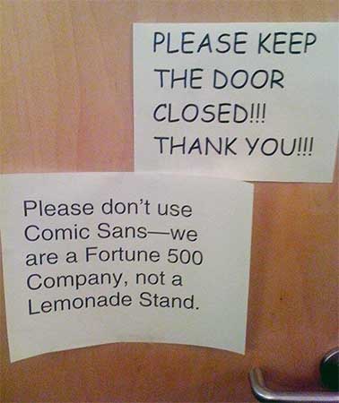
Designers have long known that fonts can communicate brand messages. Fonts such as Comic Sans and Papyrus have been mocked by designers for their use in professional designs. But these long-suffering fonts might just have the last laugh.
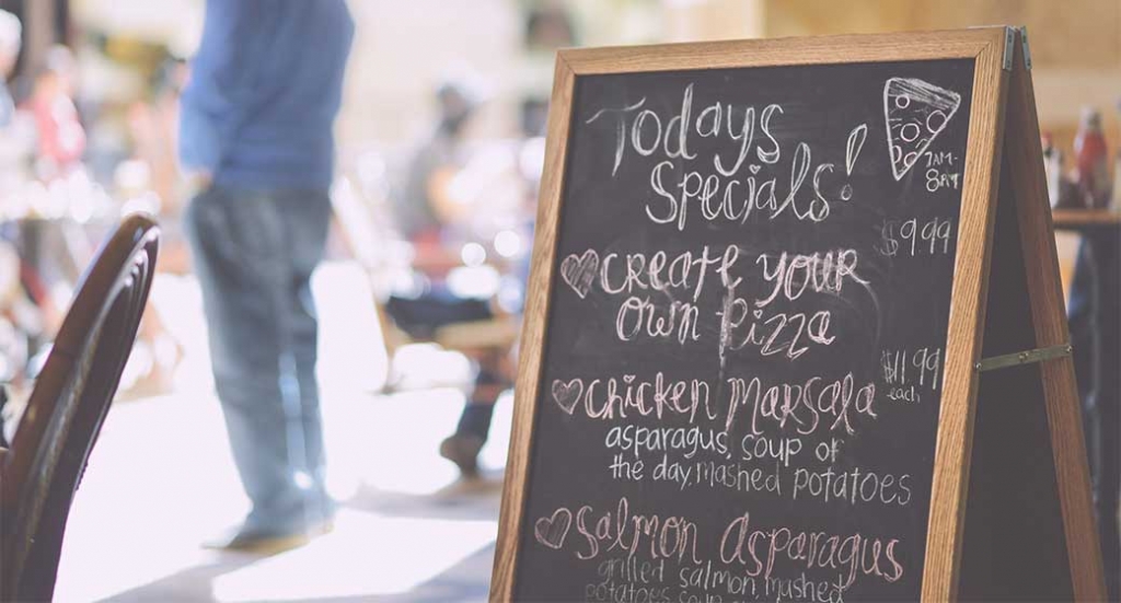
According to Stephanie Liu, assistant professor of hospitality management at The Ohio State University, menu fonts that resemble handwriting might be more influential than once thought. In her recent study published in the Journal of Business Research, Liu’s team found that menus printed with handwritten typefaces influenced customers to believe that the food was made of better ingredients, prepared with more care and was generally better for their bodies.
“The handwritten typeface conveys love, and that sense of human touch feels even more salient,” says Liu. “It feels to the customer like there is more heart, more effort, and more love in it, even though it doesn’t cost any more money.”
“The handwritten typeface conveys love, and that sense of human touch feels even more salient. It feels to the customer like there is more heart, more effort, and more love in it, even though it doesn’t cost any more money.” – Stephanie Liu
One of the most interesting aspects of this effect is that the menu doesn’t need to be actually handwritten at all. The study found that computer-generated fonts that resemble handwriting were able to produce the effect.
Professor Liu has some ideas about why this might occur. She believes that in our increasingly mechanized and automated society, the human touch can get lost. So anything that suggests the human touch is perceived favorably. Hence, menu fonts that look like handwriting trigger this response.
“As a marketing strategy, customers are just subconsciously processing information, and they feel that human touch in the letters on the menu,” Liu said. “And they feel that the restaurant put more effort into the design of this menu and they are getting this product to you with more care.”
There’s a Catch
Before you run out and change all your menus to be lovingly handwritten, you need to understand the limits of this effect. Unfortunately, the positive-response phenomenon only occurred when the restaurant was already perceived to be health-focused. The handwriting effect amplified customers’ perceptions of the brand and healthy or locally grown.
“This wouldn’t apply to a fast-food brand that sells low-quality hamburgers,” Liu said.
And while this might be bad news for some restaurants, the lessons for menu design are still quite powerful. Your design choices may have impacts far beyond how nice they look to your eye. They can influence your customers’ perceptions of your restaurant, your food quality and your brand.
Choose wisely.
